Sometime back we were faced with the challenge of representing alphabets / characters in the least no. of cells (so-to-say). This was planned to be done in a swipe fashion i.e only one cell is “active” or ON at a time.
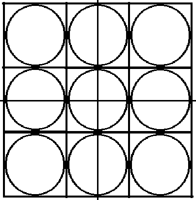
We assumed a 3×3 matrix / array would be the best and optimum solution, as an x-y or a Row-Column structure is what we are so blindly used-to following.
But as we progressed , I quickly realized that these alphabets / characters looked rather disfigured and the experience was so not satisfactory.
Our English language has lots of curvy characters and a traditional row – column matrix (especially because of our requirement restrictions of such a small number of cells 3×3=9 ) was not doing adequate justice.
And then it struck me – A beehive.
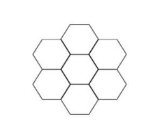
The hexagonal grid!
As I tried to set the placements right, to cover our English character set.
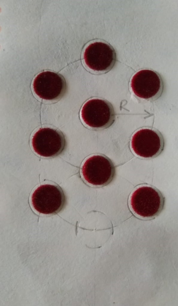
I found the use of 2 overlapping circles with the lowermost “cell location” left blank as the most optimum placement pattern.
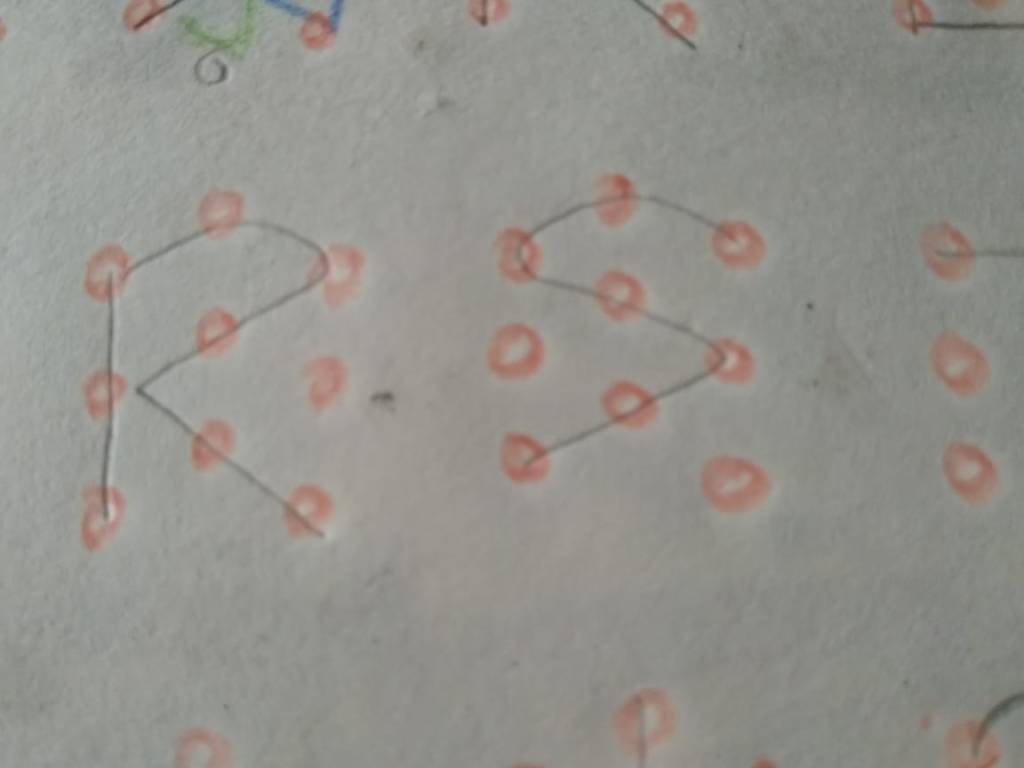
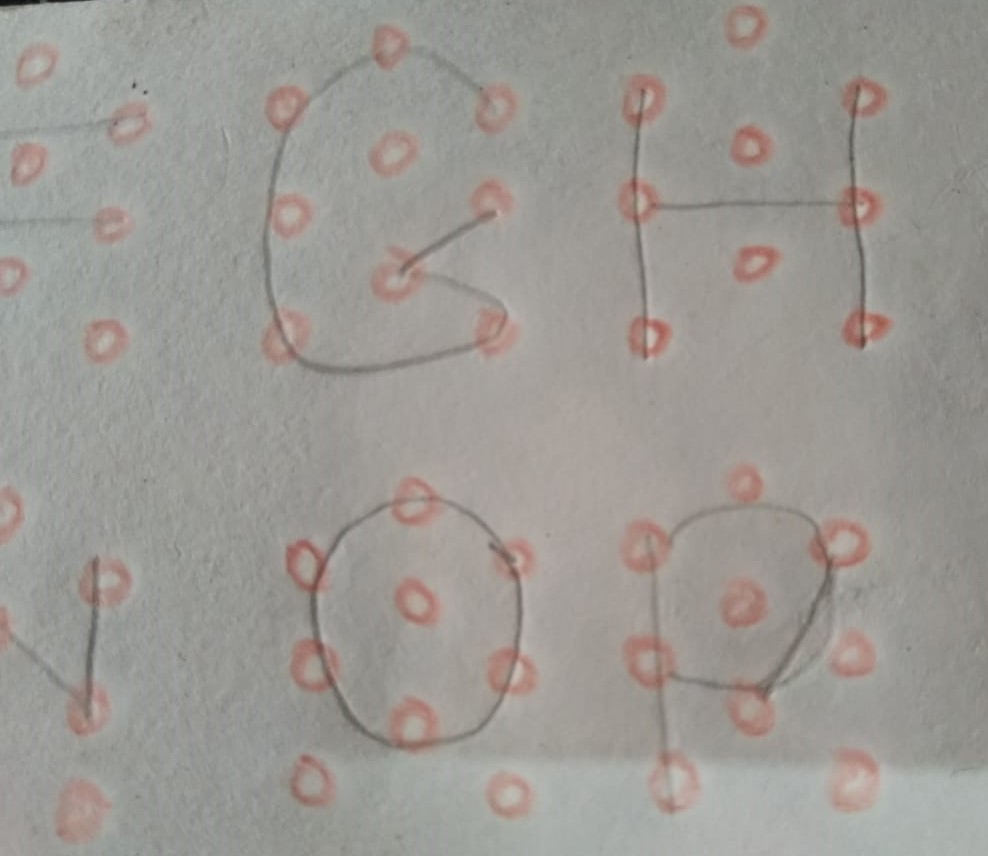
Most of our alphabet set looks good in this hexagonal grid formation.
Just pause a minute and imagine how these characters would look like in a simple 3×3 square matrix array.
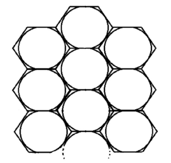
With the same number of cells as the 3×3 matrix i.e 9 cells, and just a 50% offset in the placement of the second column, a far better visualization of the English character set can be achieved with the Beehive / Hexagonal grid as against the traditional row-column or x-y grid.
